Monday 12 December 2011

WGSN Trend


When researching WGSN it was hard to find a trend that was similar to the 1950's trend in Funny Face. However i found a trend called 50's Twist: Catwalk Capsule trend inspired by the 1950's for S/S 12.

"This playful capsule trend revisits the 50s archive for silhouette inspiration and discovers defined waistlines, dirndl skirts and cropped tops. A palette of candy-coated pastels and quirky conversational prints, give these feminine, ladylike looks a feel-good factor. Be inspired by Marilyn Monroe and picture-postcard holidays."

This led me to look at how designers have incorporated the trend and used it to create a trend for S/S 12. In the trend they have used prints on material with fruit and veg. For example


As you can see WGSN has tried to include patterns from the 1950's, however during the shoot we preferred using plain clothing as during the majority of the film thats what she wears. Here is a picture showing one of the garments Audrey Hepburn wears highlighting the fruit and veg pattern trend:

Also in the trend it highlights key details of the style of clothing, including ways that the material is made where the waist line is. Sometimes it was twisted round or had material coming down, which is highlighted in the picture above. Here are two examples of how different designers incorporated the 1950's style:

During the photo shoot all three dresses came in at the waist then flared out to highlight the style of dress worn in the 1950's and Audrey Hepburn wore this style in the film. We used a mixture of light pastel colours so that the clothing didn't overwhelm the picture and stand out above the location. Also the trend highlights pastel colours, showing the type of colours that were worn in the 1950's.

Sunday 11 December 2011

Choosing the Final Images

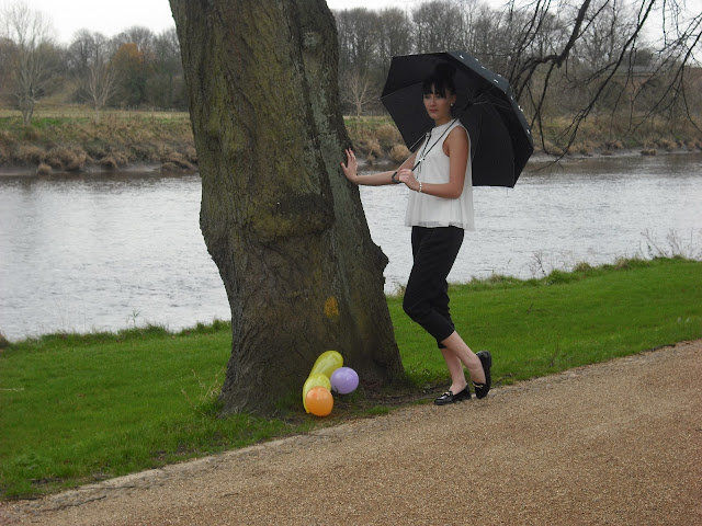
Our original concept for the ‘balloon’ image was to have the six of us in the group to walk behind the model each holding a lone balloon while the model walked in front with a dog or on a bicycle. Unfortunately, we couldn’t acquire a dog or a vintage looking bicycle so made the best of the situation by floating balloons around her. The wind made it very difficult to capture the balloons in a good angle or even in shot, so we photo-shopped them into this image.
This was our favourite of all the images we took at this location due to her stance and the centring of the trees around her. All in all it looks very picturesque and like a ‘classic’ shot. The balloons play reference back to the film and help to cement our interpretation of ‘Funny Face’. 


Many of the images from this location were all very similar, so it was difficult to decide which one looked the best. We finally decided on this on as the model’s pose was perfect and the rule of thirds used from the lamppost worked well. Also, we wanted the lamppost to be fully in the shot. The background adds to the feel of the image also, making it seem vintage as the surroundings are quite reminiscent of the film. Again, the whole image looks like a classic.


As a group we decided that these two images looked best alongside each other, like how they would in a magazine. We were torn between the image of the models walking past each other and the left-hand side photo. The lighting on the left-hand photograph was brilliant and we very fortunate to get to create this image, therefore we chose that one. It too is very similar to the film; we all really liked the concept of him taking a picture of her and wanted to recreate this. We also really wanted a lone image of our male model so it wasn’t all female based as Fred Astaire plays a major role within the film. In addition, it added something more dynamic to the shoot as a whole because sometimes magazines include male model portraits to mix things up. For that image the lighting was amazing and we were lucky enough to have beautiful shadows created. Overall these pictures look perfect alongside each other hence why we chose them.
These two images are the group’s favourite and our strongest.


The film begins in a bookshop therefore we were desperate to get a bookshop location for the shoot as we took the locations for inspiration behind the concept of the images. The lighting wasn’t great inside the bookshop and it was very difficult to create the image we wanted because it was also very cramped. In the end we decided on this image as it was one of few better ones from this location. We loved the background of books upon books and how it contrasted with her prom dress. We put a filter on the image so the lighting matched all the other images. This was our best result for this shot and we felt the model looked as we had imagined.

Saturday 10 December 2011

Editing the final pictures


We narrowed it down to 6 pictures and decided to put two of the same location together. We think this works well as it shows different angles and different perspectives of each model. We think they are the strongest pictures as the lighting really uplifts the shot.


One of the pictures was inspired by the shot of Audrey Hepburn with the balloons, however our shot didn't contain enough balloons so we decided to edit them in using photo shop. This has made a great change to the picture with all the colourful balloons surrounding the model. We also darkened the background to match the lighting of the other pictures so it looks like a consistent photo shoot, and would work well in a magazine spread.


The lighting in our first shot, with the model on the lamp post, wasn't great due to the sun being hidden. Fortunately we were able to edit this on photoshop to create a lighter background.


Glamour Magazine


After the photo shoot we decided our pictures fitted in nicely with Glamour magazine after looking into a shoot called Chic Encounter in Novembers issue. The shoot is inspired by the 1940s, and since ours was highlighting the 1950s, it helped emphasise the old, stylish outcome we were hoping for.
Here is the first pictures of the shoot in Glamour:

We thought the double page spread reminded us of the pictures with both models in the library and would work well as the first image of our collection. Glamour magazine is not just about fashion, it also contains celebrity gossip, hair and beauty and competitions. We liked that it wasn't just a fashion magazine as our pictures are based on the locations not just the garments.

Here is another picture, we liked the way the model is presented with her short dress and little black shoes, as this was how we styled the model in the lamp post pict
ure:

We found that the pictures wouldn't work as well in Vogue magazine as some of their photo spreads are on brands and are consistant in using up coming trends. Our shoot focuses a lot on the location and the significance it has with the film, rather than done in a studio, which vogue tends to use a lot.

ANYTHING ELSE YOU THINK I SHOULD ADD???

Tuesday 6 December 2011

Shoot Day: 24th November

Ok, its 9:40 in the morning on the first day of our shoot and so far we seem to be facing a bit of bad luck, we have been unable to do our bookshop shoot as it doesn’t open until half 10, we can’t have the café until 4:00, we have no transport, no male model until half 10 and when we finally turn up to our remaining location there are huge orange barriers around the lampposts! However every cloud has a silver lining so we press onwards!  Dave is being very patient all things considered!
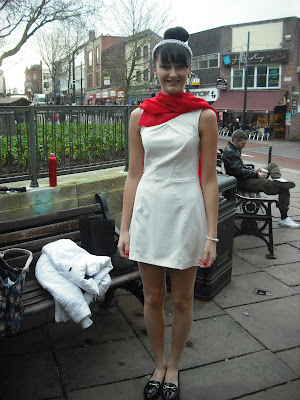
10:00 the model has arrived and Kelly and Ashleigh are making tracks with hair and makeup. Our first location is situated just outside Harris Museum using the old style lampposts, with our model Aimee Shields wearing a white shift dress, red satin scarf and pearl accessories. Curled around a lamppost the poor girl looks freezing but extremely ‘Audrey Hepburn’.
Were in look a tiny bit of sun light has just forced its way through the buildings as Dave runs to grab his reflector. Our luck begins to pick up as we all see the potential of our ideas.


Pictures from left to Right: Aimee posing on the lampost as Dave take various shots, Our original lamposts surrounded by orange barriers.

It’s freezing and we are now sat on the steps of the bookshop waiting for the owner, more bad luck!
The café owner from next door kindly allows us to prepare Aimee whilst waiting and in the meantime our male model Danny arrives so we decide to go back to Harris Museum for our shots focused on ‘Fred Astaire’ photographing ‘Audrey. As we make our way to the museum we notice the dreaded building works exactly where we want to shoot! The museum allows us to shoot just inside the door which is equally as great for our idea as the original location. We choose to have Aimee(Audrey) in a trench coat for this shot and Danny (Fred Astaire) wearing a basic shirt ,pants and black tie with his sleeves rolled up and top button slightly undone to make him look more edgy. Dave took a number of shots focusing completely on Danny from Aimee’s point of view and from Danny’s own point of view, it was a struggle preventing people walking behind and posing for the cam but we managed it, as we sifted through the images we all felt a bit of excitement as we began to see our ideas become reality and the early morning bad luck started to disappear. Before long we make our way to the bookshop after stopping to grab a hot choc to warm us up. As we enter the bookshop we realise Becky wasn’t over exadurating when she said ‘it’s a bit of a tight squeeze’. The owner allowed us to use the cellar which was perfect for our aim, we took various shots of Aimee reaching for books and sitting around reading. We attempted a shot of Danny and Aimee together in the bookshop but after the first few pictures we all agreed that we weren’t feeling the idea so decided to move on.


At 12:45 we parted from Dave, We were all thinking ‘What are we going to do without him and his reflector’! We had a short lunch break as Kelly, Ashleigh and Amy left for their class and Ailsa, Becky and I along with our model Aimee made our way to the park. As we got there we noticed the long stretch of river surrounded by trees and a narrow path from one side of the park to the other which was perfect for our idea, we ideally wanted Aimee walking along the River holding an umbrella surrounded by colourful balloons. Before long we realised the wind wasn’t on our side as our attempt failed as we watched the balloons blowing away or popping due to the cold. Soon enough the cold got the better of us so we made our way to a small seating area Becky had spotted, walking through mud and past crazy enthusiastic ‘Walkers’ doing their exercises we sheltered in the hut and laid out the remaining balloons around Aimee as she sat down gazing across the park, the lighting coming through the trees was perfect for this shot for a short time as poor Aimee dressed in only a blouse and black 3 quarter trousers tried to make the best of the cold weather. Once we were satisfied with what we had we made our way to the café, feeling reasonable relaxed and confident.
All in all we had a fantastic day despite a few mess ups but we managed to work round it and are pleased with the results.


                                                                      Many thanks to our 2 models Aimee and Danny


Monday 5 December 2011

The Shoot

Overall the shoot went really well, and the pictures look fantastic! A few hiccups at the start with location problems, but we managed to pull it all off and it was all worth it!